THE
EDMONTON OILERS 3RD JERSEY STORY
From
the Oilers' official website, edmontonoilers.com
| Two
years in the making, the Edmonton Oilers have released their 3rd Jersey.
So what's the story behind the logos? |
| Here's
a quick explanation from designer Todd McFarlane. |
| |
The
PRIMARY Mark:
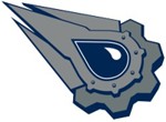 |
| Sharp,
blade-like shapes signify both the blades of a hockey skate and the
fast-paced, exciting tradition of Edmonton Oilers Hockey. |
| The Five
Rivets that form around the oil drop represent the five Stanley Cups won
by the Edmonton Oilers Hockey Club since its entry into the NHL in 1979.
There are also ten gear teeth on the primary mark; five on the large outer
gear, and five on the inner gear. Each gear tooth represents each of the
previous team captains in the Edmonton Oilers NHL History. |
| Inner and
outer gear shapes signify strong and formidable force while reinforcing
the concept of teamwork and industriousness. They provide the stability
upon which the 'well-oiled machine' is built. Gears, like team members,
need to be strong and work together in order to succeed. They operate in
a dynamic environment and always need to be ready to perform when called
upon. |
| The Oil
Drop is derived from the original Edmonton Primary mark. It has been
turned on its side to accommodate and reinforce the speed of the new primary
mark. It has also been given a highlight to help define and distinguish
it from the rest of the logo. The Oil Drop creates the transition between
the tradition of the original Edmonton Oilers logo and the launch of the
new one for the third jersey. |
| These elements
provide the perfect mixture of the rich tradition and history of the team,
its players, and its legacy blended together into a brand new modern hockey
logo. Of course, there's always room on the logo to add extra rivets. |
|
| |
|
The
SECONDARY Mark:
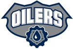 |
| The type
of treatment of the word "OILERS" portrays classic strength and boldness
in the tradition of both professional and collegiate level sports,
as well as paying tribute to retro gas station and oil company logos of
the past. |
| The top
of the shield logo signifies two things. First, the three peaks form
a crown at the top of the badge that references and pays homage to the
Edmonton Oilers roots as the "Oil Kings." Second, the badge or shield-like
style of this mark is meant to evoke a sense of authority and command that
is commonly associated with both military and police enforcement marks
and badges. Sports in general, and hockey in particular, are all about
mental and physical strength and intimidation. This mark is a tribute to
that. |
| The gear that
completes the bottom of this mark is meant to compliment those seen in
the new primary mark. Again, the gear itself represents strength, teamwork,
and fortitude. It has to work hard and be unrelenting in order to perform
what needs to be done, day in and day out. The analogy to athletic excellence
and achievement and consistency here is an obvious one. This gear, like
those in the primary mark, also contains five rivets mean to signify each
of the Stanley Cup Championships won by the Edmonton Oilers Hockey Club.
Of course, the Oil Drop has been brought over from the original primary
mark and been placed prominently in the centre of the gear, where it belongs. |
|
|
|
|
|